Card layout
A card's layout is standardized, and has undergone several changes since Konami's OCG/TCG card game and the anime was first introduced.
Contents
Description[edit]
- Card type
- Card name
- Attribute symbol
- Monster Level/Rank stars
- Spell/Trap type and type symbol
- Card image
- Card image border
- Edition text
- Card Number
- Pendulum Scale (on Pendulum Monsters)
- Link Arrows (on Link Monsters)
- Card text boxes
- Card text box borders
- Monster type
- Effect or flavor/lore text
- ATK and (DEF or Link)
- Password or limitation text
- Copyright notice
- Eye of Anubis hologram
Typefaces[edit]
This section needs additional citations for verification. |
Many different typefaces have been used on Yu-Gi-Oh! cards depending on the primary script(s) of the language in question and the type of text. Most of these listed typefaces were identified visually, although Matrix and FOT-Rodin have been found embedded in rule books or as video game assets.
The OCG makes extensive use of various clerical script typefaces (pronounced reisho in Japanese, yeseo in Korean and lìshū in Mandarin). Only the Simplified Chinese version deviates from this norm with a regular script typeface (pronounced kǎishū in Mandarin).
| Feature | Language(s) (primary script(s)) | ||||
|---|---|---|---|---|---|
| English, French, German, Italian, Portuguese, Spanish (Latin) |
Japanese (kanji, kana) |
Korean (hangul) |
Mandarin, Cantonese (Traditional Chinese) |
Mandarin (Simplified Chinese) | |
| Card name | Matrix Small Caps Regular | DF LeiSho Semi-Bold (base) DF Kaku Tai Hi (base) (Latin characters and numerals) FOT-Rodin Bold (ruby) |
HY Yaeso Medium (base) (prior to Starter Deck 2011) Asia Yeseoche Bold (base) Sandoll Book Bold (ruby) |
HanWang LiSu Medium | DF Kai W5 |
| Attribute base | DF LeiSho Semi-Bold | ||||
| Attribute ruby | ITC Stone Serif Bold | FOT-Rodin Bold | Sandoll Book Bold | — | |
| "[Spell Card]" / "[Trap Card]" text | ITC Stone Serif Small Caps Bold | DF LeiSho Semi-Bold (base) FOT-Rodin Medium (ruby) |
Sandoll Book Bold | HanWang LiSu Medium | DF Kai W5 |
| "1st Edition" text | ITC Stone Serif Bold | — | ITC Stone Serif Bold | — | |
| "LIMITED EDITION" text | ITC Stone Serif Semi-Bold | — | ITC Stone Serif Semi-Bold | — | |
| "DUEL TERMINAL" text | Gothic Bold | — | |||
| "Replica" text | ITC Stone Serif Regular | — | |||
| Card Number | ITC Stone Serif Regular | Gothic Regular (series 2) ITC Stone Serif Semi-Bold (series 3 and later) |
ITC Stone Serif Regular | ITC Stone Serif Semi-Bold | ITC Stone Serif Regular |
| Type and Ability | ITC Stone Serif Small Caps Bold | DF Leisho Semi-Bold (base) FOT-Rodin Medium (ruby) |
Sandoll Book Bold | HanWang LiSu Medium | DF Kai W5 |
| Lore | ITC Stone Serif Italic (flavor text) Matrix Regular (effect text, and flavor text of the illegal Egyptian God cards) |
DF Leisho Semi-Bold (base) DF Kaku Tai Hi (base) (circled numbers) FOT-Rodin Medium (ruby) |
Sandoll Book Light | HanWang LiSu Medium | DF Kai W5 |
| ATK/DEF | Matrix Small Caps Regular | DF Leisho Semi-Bold (series 2 and earlier) Matrix Small Caps Bold (series 3 and later) |
Matrix Small Caps Regular | Matrix Small Caps Bold | |
| Link | RoG2 Sans Serif Std B | RoG2 Sans Serif Std B | |||
| Pendulum Scale value | Matrix Small Caps Bold | Matrix Small Caps Bold | |||
| Password | ITC Stone Serif Regular | ||||
| Limitation text | ITC Stone Serif Semi-Bold | FOT-Rodin Medium | SJ Gothic | — | |
| Copyright notice | ITC Stone Serif Regular | FOT-Rodin Medium | ITC Stone Serif Regular | FOT-Rodin Medium | ITC Stone Serif Regular |
OCG/TCG[edit]
Series 1 layout[edit]
This was the first version of layout for cards, lasting from the initial release of the Official Card Game with Vol.1 to the end of Series 1 with the release of Dark Ceremony Edition. This layout was used in early episode of the NAS anime
Cards with this version of the layout are characterized by a larger card image and, for Monster Cards, two half-width boxes below the picture, side-by-side, with the left one for the monster's card effect or lore, and the right one for its ATK and DEF, which use the terms
Series 1 cards lack Card Numbers and the Eye of Anubis Hologram.
|


|

|

Series 2 layout[edit]
The next version of card layout was used for the duration of Series 2, being introduced with the release of Magic Ruler and lasting until Pharaonic Guardian and Structure Deck: Pegasus (which were released on the same day).
The difference between this version and the first one is the widening of the effect/lore box on Monster Cards to about two-thirds of the card's width, featuring a new look of the box border, and a corresponding narrowing of the ATK/DEF box, achieved mainly by shortening the terms for "ATK" and "DEF" to just
This version introduces Card Numbers and the Eye of Anubis Hologram.
|


|

|

Series 3 layout[edit]
The third, and by far longest-lived, version of card layout was introduced with Series 3, beginning with Limited Edition 4, and is the card layout that the TCG was introduced with. It has been called the World Unified Format (世界統一フォーマット Sekai Tōitsu Fōmatto).
This version is marked by a shorter, square card image and a unified, taller box for the card effect/lore and ATK/DEF. OCG cards feature the English text "ATK" and "DEF", and three-character set prefixes (with the uses of one of the Matrix fonts) and three-digit set position numbers are introduced (with the uses of one of the ITC Stone fonts). Level 12 monsters have their Level Stars aligned to the right and put closer together unlike lower Level monsters. In early sets of this series, Spell Cards (
This layout was released internationally before the end of series 2 in Japan: while the final series 2 sets were released on March 21, 2002, the first series 3 set was released on March 8, the private release Summoned Skull Sample promotional card was distributed in 2001, and the limited release Duelin' Monsters Giveaway was distributed in November 2001.
|


|


Series 4 layout[edit]
This layout, introduced with Series 4, was a small update to the Series 3 layout which added two-letter region identifiers for all Card Numbers; previously, they had frequently been omitted for North American English and Japanese cards.
|

|


Series 5 layout[edit]
Introduced with Series 5 with the release of Power of the Duelist, this layout introduced four-character set prefixes for Card Numbers to allow for Structure Deck: Machine Re-Volt, which had the set prefix "SD10". Like the Series 4 layout, this layout was otherwise identical to the Series 3 layout; Level 12 monsters have their Level Stars aligned to the center.
|


|


|


Series 6 layout[edit]
This layout was introduced with Series 6, and featured the furigana on the names of Monster Cards being unified to black to accommodate the accompanying introduction of Synchro Monsters; prior to this, some monster furigana was printed in white.
|


|


|


Series 7 layout[edit]
Introduced with Series 7 with the release of Starter Deck 2010, a few more small changes were made. These included lightening the background of the effect box to make the text easier to read, and making the effect box taller and wider to allow for cards with longer effects. The card image and name box were shifted slightly upward to allow for the larger effect box, and the name box was widened to maintain roughly equal margins on its sides and top. The font used for Korean cards' names was changed since Starter Deck 2011. This layout is used in Yu-Gi-Oh! ZEXAL.
|


|


|


Series 8 layout[edit]
Introduced with Series 8 with the release of Starter Deck 2012, other small changes were made. These include larger artwork and Level/Rank stars on Monster Cards, with very little extra space around the stars and attribute icon. On cards with a short effect or flavor text, the text is printed in a larger font size, making it easier to read. Some of the TCG versions of Monster Tokens have the bar over the ATK and DEF signs added, while OCG tokens have been changed to look much more like regular Monster Cards, with the Token's name, Attribute icon, Level stars, ATK and DEF, and extra detail in the lore; some Tokens of the characters from Yu-Gi-Oh! media include some of their theme lines in the card text box, while others also have the V Jump logo as a watermark featured on the background of the box. The kanji in the attribute icons of Japanese Spell and Trap Cards are slightly repositioned to be more centered; the icons on TCG cards are unchanged.
|


|


|


Series 9 layout[edit]
This layout was introduced with Series 9 with Starter Deck 2014. It added Pendulum Monsters, which feature an artwork box that has been widened to line up with the card description box; the background of the Pendulum Effect and Pendulum Scale boxes are slightly transparent and the main lore box is even more slightly transparent from top to bottom, allowing the overlapped portion of the artwork to be seen, which makes Pendulum Monsters' artworks be almost fully shown unlike any other card type before. Some cards with long Pendulum Effect text have increased height for the text box. The artwork, Pendulum Scale, Pendulum Effect and main lore boxes are put in gray frames instead of the traditional orange frames. The Card Number is placed on the right-bottom of the main lore box.
For all cards, the main lore box has been slightly widened, while the card name box has become shorter and wider; this leads to the reduced size of the card's name and Attribute symbol, and allows more room for Level/Rank stars on Monster Cards as well as Spell/Trap property indicators. Additionally, the aforementioned stars and text/indicators have been made smaller; these changes slightly increase the padding in that area of the card, compared to the Series 8 layout which drastically reduced it. Also, the edition text (eg. "1st Edition") is placed right next to the password. If the monster's main lore gets too long, the font size of the Type/Ability text is reduced to provide more space.
Several changes are also made in the Japanese and Korean terminology and card grammar: for the first time, Flip (リバース) is treated as an Ability similar to Tuner, Union, Gemini, etc. and is listed next to the monster's Type in the card description; the word 効果 (Effect) is now always written on the Type/Ability line for monsters with Abilities that have effects, being omitted in the past; these changes are also applied to TCG cards, although the word "FLIP" is still kept in the card text; as for TCG Flip Effect Monsters that have an effect other than its Flip Effect, that effect is written in another paragraph. The middle dot (・) is no longer used on the type line on Japanese prints. Some terms like "Life Points", "Synchro", "Xyz" and "Pendulum" are abbreviated in the card text as "LP", "S", "X", and "P" respectively with appropriate furigana so as to take up less space; so far, only the term "Life Points" is known to be abbreviated in TCG and Korean card text.
Japanese and Korean card text now follows a new pattern similar to the TCG Problem-Solving Card Text: Marking circled number:Timing/Targeting (if any), Costs (if any). Resolution. Each effect is written in at least one sentence and marked with a circled number (①, ②, etc.); thus any text written before the number 1 (①) is not an effect and cannot be negated by the effects of cards such as "Skill Drain". The effect's timing, targeting, and costs follow the effect number and colon in one sentence; timing and targeting are separated from costs by a comma, which is dropped if an effect has no cost. The effect's action and resolution follow in a separate sentence(s).[1] Also, new text patterns used for mentioning the support for an archetype, such as 「~」カード ("~" card) or 「~」モンスター ("~" monster), begin to be used instead of the old ones such as 「~」と名のついたカード (card with "~" in its name) or 「~」と名のついたモンスター (monster with "~" in its name).[2]
Traditional Chinese cards from Series 9 used the Series 8 card frames. Starting with the release of Structure Deck: Machiners Command, the Series 9 card frames are used instead.
The Series 9 format is used in Yu-Gi-Oh! ARC-V and Yu-Gi-Oh! The Dark Side of Dimensions.
|


|


|


|


Series 10 layout[edit]
The Series 10 format is used in Yu-Gi-Oh! VRAINS. It added Link Monsters, which feature a new blue layout with a hexagonal honeycomb-like pattern, the addition of Link Arrows, and the Link Rating (which uses a new font). Card Numbers on Link Monsters are moved a little to the left, so as not to be covered by the bottom-right Link Arrow. The Link Arrows of all foil cards are made transparent to make them shine from the foil underneath.
Otherwise, the layout is largely unchanged, save for the embossed effect defining the box containing the card name and Attribute now being sharp and square like the card artwork border, rather than being soft and curved like previous layouts, in addition to an added embossing effect just before a card's grey border. Also, Normal Monsters now have "Normal" explicitly written in the type line, in order to differentiate them from Non-Effect Monsters. In addition, for foil cards (except for OCG Holographic Rare cards with Xyz Monsters being the only exception), the Attribute Icon and Level/Rank stars for Monsters as well as the Spell/Trap Icon were made transparent to make them shine from the foil underneath. The Attribute icons now have a very faint outline that is somewhat a darker version of their dominant color (for example, the DARK icon has a faint purple outline), and the text on them is also slightly realigned; longer TCG text, which is printed in white, is prone to flowing out of the edge of the icon, therefore is lightly outlined to stand out only on white-backgrounded Synchro Monster Cards. The height of the Pendulum Effect text box is now fixed rather than variable for short and long text.
Since the start of Series 10, there have been several unusual characters used in OCG card names. Two particularly difficult ones include Ϝ (Greek digamma) and ∀ (math symbol meaning "for all"). The Korean fonts cannot accommodate these characaters, which have been only customly added to the Japanese fonts, therefore the Korean prints of the cards that contain them simply use the Japanese fonts.
The OCG card text received a couple of minor adjustments. If a card or effect with a specific card name can only be activated a limited number of times per turn, such as "Sangan", the card is referred to as このカード名の (this card's name) rather than the specific name of the card. The Extra Deck is abbreviated as "EXデッキ" (Extra Deck).
|


|


|


Series 11 and 12 layout[edit]
The Series 11 format was introduced with Rise of the Duelist. For the OCG/TCG, the layout is identical to Series 10's in nearly every way, save for two details:
- All card types now use a slightly paler shade of their previous background colors.
- The copyright notice on the bottom-right corner of Japanese cards was changed from 「©高橋和希 スタジオ・ダイス/集英社」 (© Kazuki Takahashi - Studio Dice/Shueisha) to 「©スタジオ・ダイス/集英社・テレビ東京・KONAMI」 (© Studio Dice/Shueisha, TV Tokyo, Konami). For TCG cards, it was similarly changed from "©1996 KAZUKI TAKAHASHI" to "©2020 Studio Dice/SHUEISHA, TV TOKYO, KONAMI".
The Series 12 layout has no difference at all to the Series 11 one.
Anniversary layout[edit]
In celebration of Yu-Gi-Oh!'s fifteenth anniversary, several cards were released with a modified layout: the OCG Anniversary Pack, the Weekly Shōnen Jump promo versions of "Dark Magician" and "Magi Magi ☆ Magician Gal", the V Jump promo versions of "Obelisk the Tormentor", "The Winged Dragon of Ra", and "Slifer the Sky Dragon", and the Duel Art Campaign Promo Card "Holactie the Creator of Light". The Anniversary Pack was later released in the TCG (with the exception of "Dark Magician Girl") and the other cards as Shonen Jump promotional cards (with the exception of "Holactie the Creator of Light" and "Magi Magi ☆ Magician Gal").
The biggest differences between the main layouts and the anniversary layouts are the distinctive lack of a border around the card image, which instead only has a drop shadow to distinguish it from the card's background, and Kazuki Takahashi's signature, which is usually included in the lower right-hand corner of each card's artwork. The artwork is a special variant drawn by Takahashi himself in celebration of the anniversaries. "Magi Magi ☆ Magician Gal" and the legal Egyptian God cards have no password in the lower left-hand corner. Finally, the English prints of Normal Monsters using this layout (except for "Dark Magician") uniquely have a different text style than other Normal Monsters, using the Matrix font in regular type in the case of the Anniversary Pack, and in italic type in the case of the Shonen Jump "Blue-Eyes White Dragon".
|


|


|


|

Rush Duel[edit]
The cards in Yu-Gi-Oh! Rush Duel use a new layout intended to be simple to understand and visually appealing. A Rush Duel card's art frame and effect text box are significantly larger, taking up most of the void space on the card, including the space where the Level was indicated on a TCG/OCG card. However, the Attribute symbol retains its position and is enlarged, creating a section overlapping the corner of the artwork. The Level value has consequently been altered and moved. It now displays a number over a single enlarged Level star graphic, and it has been moved to the bottom left corner of the artwork, as have the ATK and DEF values. The ATK and DEF values are contained in a transparent black section ending with a triangular slope, and are additionally differentiated from one another by a colored box around the statistic name: red for ATK and blue for DEF. The Type line's location is unchanged and is displayed below the Level, ATK and DEF on a section the same color as the card frame, rather than the effect text box; this same section is used to display the card type of Spell and Trap Cards, including their symbol. All cards display their copyright notice at the bottom left of the card in a black section, their card number at the bottom right in the same section, and the phrase "RUSH DUEL" printed in a trapezoid section covering the middle of the black section.
Maximum Monsters were introduced in Maximum Ultra Enhancement Pack. While largely identical to standard Rush Duel cards, their "central" monster additionally includes their MAXIMUM ATK value printed above the ATK and DEF values with the statistic indicator in a gold box extending from the start of the ATK box to the end of the DEF box, and the overall value contained in another transparent black box, also ending with a triangular slope, whose slope runs along the same plane as that of the ATK and DEF box.
Over Rush Pack introduced Over Rush Rares, cards with portions of their art that extend out of the art frame. The extended art can cover the sides of the frame, including up to the edges, and the name and Attribute box, but cannot cover the card's name, Attribute, Level, MAXIMUM ATK, ATK or DEF value, and it cannot extend past the bottom of the frame.
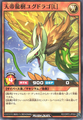
The left part of a Maximum Monster ("Yggdrago the Sky Emperor [L]")
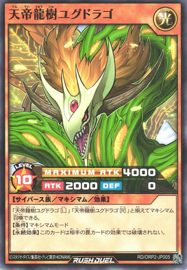
The center part of a Maximum Monster ("Yggdrago the Sky Emperor")
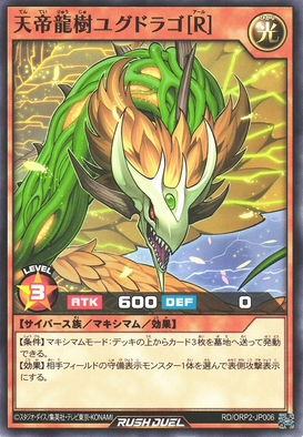
The right part of a Maximum Monster ("Yggdrago the Sky Emperor [R]")
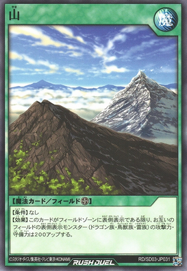
A Field Spell Card ("Mountain")
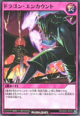
A Trap Card ("Dragon Encounter")


Anime[edit]
In the dubbed versions of the anime, card layouts are changed due to Federal Communications Commission (FCC) regulations.[citation needed] Monster Cards are edited to include only the artwork, Level/Rank and Attribute symbols and ATK/DEF values, removing any text that was visible in the original version. Similarly, Spell/Trap Cards are edited to remove virtually everything, leaving only the artwork and a Spell/Trap symbol in an empty text box. Some furigana letters still remain in Attribute symbols and the Spell symbol.
Yu-Gi-Oh![edit]
Early episodes of the original Japanese anime used the real-life series 1 and 2 layout with no furigana in the lore box. In Season 4, the real-life series 3 layout was used instead.
Early episodes of the English-dubbed anime placed the Level of Monster at the center of the space betwen the left side of the card and the Attribute symbol. In later episodes, the Level is really centered, with exception to monsters that debuted in early episodes. Monsters with a Level higher than 10 do not have their Level centered, due to space constraints. Some monsters ATK/DEF values are right aligned.
|


-JP-Anime-DM.jpg)
|


-EN-Anime-DM.jpg)
Yu-Gi-Oh! The Movie: Pyramid of Light[edit]
The Japanese movie follows the real-life series 3 layout (but unlike the regular anime series, furigana is included on all texts), and so does the English-dubbed version. No card number or password is included.
|
|


Yu-Gi-Oh! GX[edit]
Yu-Gi-Oh! GX follows the same layout design as the later episodes of the Duel Monsters anime. Some cards from the Japanese anime include furigana on their lores, while others don't.
|


Yu-Gi-Oh! 5D's[edit]
Yu-Gi-Oh! 5D's follows the same layout design as the previous series anime. Only a few cards from the Japanese anime include furigana in the card lore box.
|


Yu-Gi-Oh! ZEXAL[edit]
The Japanese anime uses the real-life series 7 layout with no furigana in the card lore box. In the English-dubbed anime, the Rank of an Xyz Monster is not centered and is instead left aligned. All other cards have followed the layout of the previous series.
|


Yu-Gi-Oh! ARC-V[edit]
The Japanese anime follows the real-life series 9 layout with no furigana in the card lore boxes, except on abbreviated Latin letters (such as "P" for "Pendulum"). In the English-dubbed anime, the scales of all Pendulum Monsters are at the bottom corners of the image, the colors between the one associated with the type of Monster (Normal is Yellow, Effect is Orange, Ritual is Blue, etc) and the Spell color (green in this case) are at the middle of the stats of the card, and the card's image at the bottom (where the Pendulum effect box covers it in the real cards) is drawn. All other cards have followed the layout of the previous series.
|


|
|


Yu-Gi-Oh! VRAINS[edit]
The Japanese anime follows the real-life series 10 layout. In the English-dubbed anime, the layout has been revised for all cards, increasing the height of the bottom section so that the artwork becomes a square like in OCG/TCG layouts and using the English version of all "Attribute orbs"; Link Monsters and Link Spells have their horizontal and vertical arrows moved inwards compared to real cards so that thery fit entirely within the artwork box, and for the former, the Attribute is centered to occupy the space left empty by the lack of Level/Rank and the Link Rating box is decreased in width and has a redder color.
|
|


Yu-Gi-Oh! SEVENS[edit]
The Japanese anime follows the real-life Rush Duel layout (omitting set number, copyright notice, and hologram sticker like previous anime series), even for flashbacks before the format's inception in episode 1. Starting with episode 12 however, such instances are edited to lack the "RUSH DUEL" inscription in the bottom border. Maximum Monsters also include the MAXIMUM ATK value in a golden bar above the ATK and DEF stats.
In the English-dubbed anime, the card layout is for the first time minimally changed. A blank section sharing the color of the effect text box covers the name of the card, with the edge shaped to form the side of a hexagon with the frame containing the Attribute. The Level and ATK/DEF of a Monster Card are removed from the artwork and placed in the text box, with the ATK and DEF placed parallel to one another in transparent black boxes. The MAXIMUM ATK of the middle part of a Maximum Monster is placed over the bottom of the artwork. For Spell and Trap Cards, a larger duplicate of their icon is contained within a black diagonally oriented square, and the rest of the text box is dominated by sections the same color as the card frame, leaving a minimal amount of the lighter color of the effect text box.
|


|


Manga[edit]
In the Yu-Gi-Oh!, Yu-Gi-Oh! GX, Yu-Gi-Oh! 5D's and Yu-Gi-Oh! ZEXAL mangas, the layout is fairly different from the anime and TCG/OCG ones. The texts aren't separated by lines and rectangles, and the Types and Attributes are not shown.
- The monster cards' layouts consist of the card's name, its Level (with the stars not being pictured inside a sphere), a double-border square with the artwork, a lore and the ATK/DEF (aligned horizontally).
- Normal Monsters doesn't have a lore.
- The color of the card doesn't change, except for Xyz and Monster Tokens.
- Fusion, Synchro and Xyz Monsters don't have their Materials listed in the lore.
- The Spell/Trap Cards consist of the card's name, type (it only is shown if the card is either a Spell or Trap card, and seldom specifies its Type; also, it is centered, but sometimes aligned to the right), a double-border square with the artwork and a lore.
- There are a few other types of card such as Illusion Cards, Virus Cards, etc.
|


|


In the Yu-Gi-Oh! D Team ZEXAL manga, the card images are taken directly from the OCG.
Other card games[edit]
Bandai's Official Card Game[edit]
Unlike the Konami's cards, the ones from the Yu-Gi-Oh! Bandai's Official Card Game are not coded with colors: every type of card shares a fair orange-yellow background. On the top of a card is the card name box, artistic, fair orange with red typesetting on Character Cards and black with white typesetting on other card types. Under the card name box is the text for monster type (if the card is a Monster Card) and some flavor text. Then there lies the artwork box, which has the upper side be beneath the Level stars. Note that the Level stars and flavor text are the unique features to Character and Monster Cards. As for Character and Monster Cards, on the left bottom is the rule box, and on the right bottom is the ability box for Character Cards and the ATK/DEF boxes for Monster Cards. As for Spell and Trap Cards, only the card property and effect text are written on the bottom. There is also a digit code next to the right side (or sometimes the left side) of the artwork box. Additionally, instead of having a black card border like other card types, Character Cards have a yellow one.
|


|

Collector's cards[edit]
Like Bandai's cards, Konami's collector's cards are not coded with color, either. Every card is printed on a dark-glowing background bounded by a black border. From top to bottom, lie the name text, the Level stars (as for Monster Cards) or the Spell/Trap property text (as for Spell/Trap Cards), the artwork box, the ATK/DEF (as for Monster Cards) or effect text (as for Spell/Trap Cards) on the bottom right, and the copyright notice on the left. The Level stars have various colors; the higher the Level is, the more various the colors get; the first star (counting from left to right) is always red, then the colors range from red to purple, depending on how high the Level is. The kanji 罠 is pronounced "Wana", instead of "Torappu" as in the OCG.
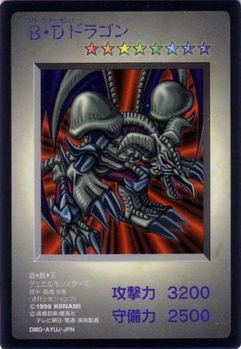
"Black Skull Dragon", a Monster Card
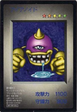
"Eyeronoid", a not-for-sale Monster Card
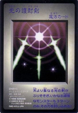
"Swords of Revealing Light", a Spell Card
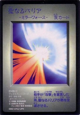
"Mirror Force", a Trap Card
.jpg)
.jpg)
.jpg)
.jpg)
Dungeon Dice Monsters[edit]
Yu-Gi-Oh! Dungeon Dice Monsters cards are designed totally differently in English versus in Japanese.
English cards are not color-coded. Every card is printed on a soil-like yellow-brown background and border. Each one consists of three boxes. On the top of the card is the name box, where the card name is aligned to the center; the typesetting size may be reduced if the name is too long. The second which is placed under the name box is the artwork box, where the image of the monster is placed on a dark background, which features a grid put in perspective. On the bottom lies the third box, contains other features of the card, including the Level and the Type (except for the "Monster Lord"), the special abilities (if any), the movement (if any), the Hit Points (if any), the ATK and DEF (if any). Underneath the latter box are the Card Number and the copyright notice.
|


Japanese cards are color-coded depending on their Types. Each of them has a black border, and consists of three boxes as well as other feature texts. The top box is for the card name, the centered one is for the artwork which contains the monster's image on a gridded black background, and the bottom one is for the special abilities (if any). Other texts include the Type and the Level above the name box, the movement and the HP/ATK/DEF between the name and the artwork boxes, the copyright notice below the box of special abilities.
|


